Have you ever played a video game in which the controls were reversed? In other words, right meant left and left meant right? If you did, you probably know that it’s not easy. It is an example of stimulus–response incompatibility.
Back in the 1950s, the psychologists Paul Fitts (well known in human–computer interaction for the law that bears his name) and Charles Seeger ran a series of experiments which demonstrated this concept. They asked people to respond to a stimulus that appeared on their left or right side by pressing two buttons:
Fitts found that participants were faster in the first condition, which presented a stimulus–response compatibility.
Definition: Stimulus–response compatibility is the degree to which the physical arrangement of the stimuli matches the location of the expected responses.
Stimulus–response compatibility is highly relevant for design. When an object or an interface violates it, its usability decreases significantly.
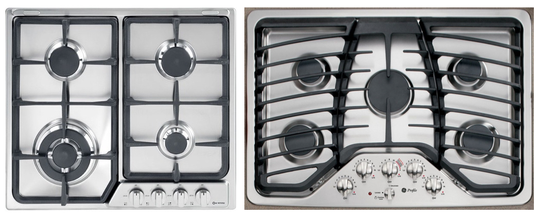
Consider these two stoves. Which knob controls which burner? Does one stove make you feel more confident in your guess?
On the left, a typical stovetop arranges burners in a two–by–two grid and the controlling knobs aligned in a single row across the bottom. This design makes it difficult for users to guess which knob controls each burner (no stimulus–response compatibility). On the right, the arrangement of the controls mimics the arrangement of the five burners, and therefore has a higher stimulus–response compatibility.
Consider this picture I took not long ago of a ticket machine at a train station. After paying with a credit card, the machine asked for my ZIP code as a security measure. But, to my confusion, the yellow numbered buttons were not touchable. Dumbfounded, I repeatedly tapped the yellow on-screen numbers, thinking that maybe the screen was frozen or had a slow response time. Then, I noticed the column of metal buttons on either side of the screen. Each column was numbered 1-6. To my surprise (and horror), pressing the button marked ‘1’ on the right column, caused a ‘6’ to appear in the zip code field. Pressing the metal button for 2 caused a ‘7’ to appear on the screen. I couldn’t believe it. It felt physically and cognitively unnatural to press one number to get a different number to appear. My slow reaction time to press each button was a direct result of stimulus–response incompatibility.
![]()
An example of low stimulus–response compatibility is this train-ticket machine, in which users had to press a button labeled with a number that did not necessarily match the actual desired number (e.g., pressing the metal button labeled 1 to get 6 to appear on screen).
The concept of stimulus–response compatibility can be extended beyond its spatial dimension. This is exactly what Don Norman does in his book “The Design of Everyday Things”.
Definition: Natural mapping refers to a design in which the system’s controls represent or correspond to the desired outcome. When controls map to the actions that will result, systems are faster to learn and easier to remember.
Natural mappings bridge the gulf of execution, helping users to understand how a system can be used and what actions are required to accomplish their goal. Designers can create natural mappings in several ways, including the three common patterns below:
Spatial similarity. This pattern is pretty much the same as the stimulus–response compatibility. By arranging controls in a spatial layout that mimics the design layout, users can understand the system faster. For example, consider the screenshot below, taken from the Display Settings menu on a Mac. When multiple monitors are connected, the Display Arrangement screen allows users to rearrange the on-screen versions of the monitors to match the actual positions of the physical monitors. For users working on extended screens, this similarity of layout helps them quickly drag files from one monitor to the other, because the layout maps closely to how the monitors are arranged on the desk.

Arranging on-screen monitors (left) to mimic the arrangement of the physical monitors (right) is an example of natural mappings, which helps users move efficiently between monitors while working.
Conceptual or metaphorical similarity. Some designs take advantage of a commonly accepted metaphor and use that as the basis for design decisions. When done well, these metaphorical mappings can serve to make the system’s functions more transparent. Consider the brightness control in the iOS Control Center. Swiping up within the control increases the screen brightness, and swiping down on the control makes the screen darker. This arrangement works because of the strong cultural metaphor “up is more,” which conceptually maps the “higher [brightness]” to the higher level. Moreover, the brightness control fills with a white background color, which also conceptually maps to the level of brightness (imagine if the fill were reversed; —that is, if a black fill indicated greater screen brightness. It wouldn’t feel natural.). Or consider color, which can have associations with specific actions — for example, in the Western world, “green is go” and “red is stop.” Designers can take advantage of such metaphors to create natural mappings. Be aware that the effectiveness of mapping is largely dependent on cultural and social conventions.

The brightness control in the iOS Control Center uses natural mapping by arranging the control so that swiping up raises the screen brightness (up is more) and swiping down darkens the screen (down is less).